Blog
Introducing Green Button Data Home Energy Report

Don’t want to read all about it? Go straight to the app.
Every month each household gets a bill from their utility provider charging them for the energy used in the previous month. We pay our utility bills in dollars, for usage that is measured in kWh. kilo-watt-hours: the number of hours times our energy usage in thousand watts. If that sounds abstract it’s because it is. kWh is an arbitrary unit. Utility companies are of course aware of that and try to provide some additional information with each bill, usually showing the current usage compared with past months. That’s not particularly insightful, because we do a bunch of different things throughout one month. We keep our lights on when it’s dark, longer in the winter, and shorter in the summer months. We blow dry our hair every morning between 7:45 and 8AM, but only on weekdays. We have that space heater that keeps the room warm when the central heating is not enough. Not to speak of that old fridge that uses so much more energy than we would expect. Everyone’s energy usage is different, and what we pay for is mentally far removed from the actual usage.
It doesn’t have to be that way. Dozens of utility companies across the country agreed on a common standardized data format that provides detailed information to their customers. This data format is dubbed “Green Button Data”. That’s a great first step. As visualizers we couldn’t just sit idly by with a data set like this one. We designed and developed an app that shows you your energy usage patterns for the past year on one screen.
Green Button Data
One thing that was important to us while making the app was that we didn’t want to require users to upload their energy data to a server in order to make use of it. This app runs entirely in the browser. When you first come to the app, it will ask you to drop or browse to your energy usage XML file. Clicking the “Show me my usage” button will then take you to the usage report where the real magic happens.
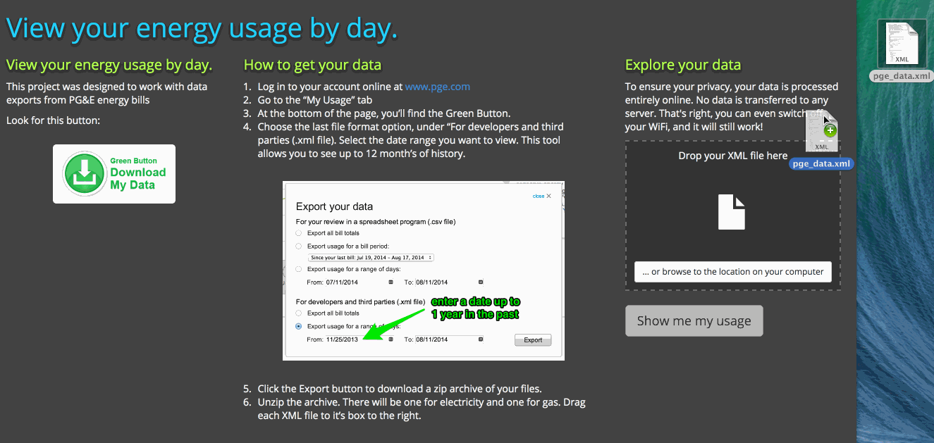
The App
The default view shows your daily energy usage for the most recent month, as well as summaries up to 12 months back (the view is limited to 365 days). The way this information is displayed is (we think) novel and interesting: Instead of showing the information as usage by day, the visualization shows how much energy you use by hour of the day. We believe this is much closer to how we actually perceive energy usage. People generally have a routine that repeats itself every day, or at least during week days. This reveals interesting patterns within each month. In addition to that, you can see the same chart for each month of the year, reflecting habitual use of energy across the four seasons. For example, energy usage is likely to be higher during early evening hours in the winter months.
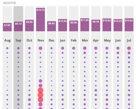
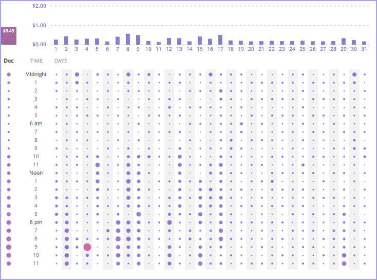
There are times, though, when you might be interested in your actual usage during a particular day. If you click on a month summary column, it will expand to reveal the detailed breakdown of hourly usage for each day of the month. If there is any regularity in how your household uses energy, you’ll be able to recognize these patterns in the visualization.
We also submitted this project as a contribution to the Energy Data Challenge, a competition organized by the US Department of Energy. Please vote for the project if you like it! :)
The energy.gov voting process can be tricky to figure out. Here’s a screen capture to get you started…

Older posts
-
Move-O-Scope Visualizes Your (Not so) Secret Life
20 May 2014
-
A New View on Your Moves Activity
08 May 2014
-
The Tufte Totem in Information Designland
10 Dec 2013
-
Looks Matter: How Art Serves Data Science
30 Jul 2013
-
Global Land Temperatures since 1900
23 Jul 2013
-
Self-Immolations in Tibet - Al Jazeera
10 Mar 2013