Looks Matter: How Art Serves Data Science
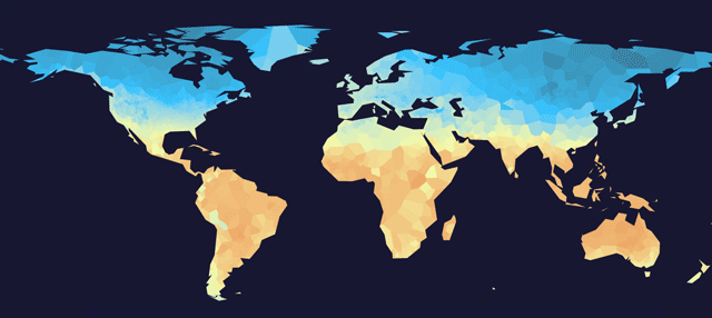
When we create data visualizations, we put a lot of effort into either crafting a story or enabling users to analyze a dataset by exploring it visually. Most of the time, this distinction is helpful and easy to draw, but occasionally the lines between these two extremes are blurred. We recently published a visualization of global land temperatures since 1900. The process of creative discovery that led to the final project made us rethink how we view the various purposes of data visualization. We believe that good data visualization doesn’t only rely on sound science and design, but is often times most effective when it taps into our love for art. In other words, we strive to make data more visceral.
THIS JOURNEY WAS UNPLANNED
The story of this project begins with coffee, we wanted to make maps that showed where in the world coffee grows best, and where it goes after it has been harvested. We explored worldwide coffee production data and discussed how to map the optimal growing regions based on the key environmental conditions: temperature, precipitation, altitude, sunlight, wind, and soil quality.
The first extensive dataset we could find contained temperature data from NOAA’s National Climatic Data Center. So we set out to draw a map of the earth based on historical monthly temperature. The dataset includes measurements as far back as the year 1701 from over 7,200 weather stations around the world.
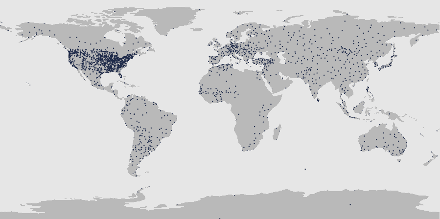
Each climate station could be placed at a specific point on the globe by their geospatial coordinates. North America and Europe were densely packed with points, while South America, Africa, and East Asia were rather sparsely covered. The list of stations varied from year to year, with some stations coming online and others disappearing. That meant that you couldn’t simply plot the temperature for a specific location over time.
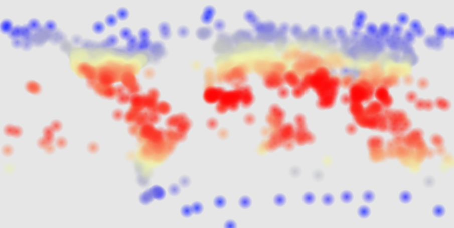
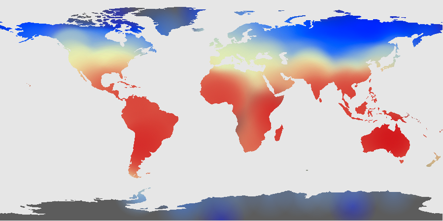
Plotting these individual stations provided a decent representation global temperature zones. However, we wanted to show temperatures across areas, not only at discrete points. To create an accurate temperature map, we would need models that incorporated local topography and climate variables. We don’t have those complex climate models on hand, so we instead aimed to generate a quick approximation that could be rendered in a browser. After some experimentation, we decided to use Voronoi Tesselation to draw our map, primarily because the method lends itself to turning points into contiguous areas.
At this point, we had a passable approximation of a global temperature map, but we couldn’t easily find other data relating to precipitation, altitude, sunlight, wind, and soil quality. The temperature data on its own didn’t tell a compelling story to us. Sure, global temperatures have increased by a couple degrees over the past century, but that’s not a story we were after.
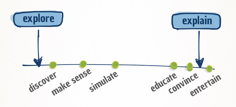
To better understand the purposes of visualization projects, we place them on a “visualization spectrum” from “exploration” to “explanation”. We saw this temperature map as an exploratory tool, but it was unclear what there was to be discovered – it fell off the left end of our spectrum. So we put the project on a back shelf and forgot about it for a while.
A few months later, we were inspired by all of the amazing visual programming work shown by artists at EYEO. We were reminded that it’s valuable to release sketches and incomplete ideas. Keeping experiments sitting on our hard drives and hidden from the world does not help anyone. By releasing ideas, you give them a chance to live on in unexpected forms. So, we decided to revisit the temperature map and package it up into something sharable.
THE ROLE OF BEAUTY
There are two phenomena we see in our work:
1) Obsessive technical correctness and criticism of “Chart Junk”
In this industry, there is an obsessive focus on functionality of charts and the precise representation of data. While we sometimes fall prey to the this, we inherently believe this comes at the expense of presenting data with a focus on the human emotional appeal. There are knee-jerk reactions to any visual decoration that may distract readers from the raw data or be deemed unnecessary. Charts that might be considered visually pretty but aren’t obviously useful are tossed out and dismissed as ‘over-designed’ or incomprehensible art work. We’ll often hear: “It looks cool, but what story does it tell me?”
2) The importance of user centered design
When working for startups, we are typically focused on understanding the users’ needs. We persistently tie all meetings and tasks back to solving a specific problem for the users. If we can’t define valid user needs based on real-world evidence, such as user interviews, then we’re forced to rely on assumptions or pause the project until more information can be gathered.
I’m not saying that these two principles, correct visualization techniques and user centered design, are not important. It is a problem when people create charts that are unreadable or create products in a vacuum without solving real problems. BUT, an unwavering insistence on utility 100% of the time limits us from experimenting and honing our talents regarding the other aspects of design.
In his book Emotional Design
, Don Norman breaks down the appeal of a product into three aspects.
Visceral
relates to the aesthetic beauty and pleasure that a product offers.
Example: A beautiful teapot.
Behavioral
relates to useful functions that a product offers to empower a user in some way.
Example: A teapot that has clever additional functions.
Reflective
relates to the greater meaning that a product can evoke. A product may offers some greater awareness and commentary about the world.
Example: A teapot that cannot be poured, making the user think about the concept of the teapot itself, and how it relates to the world.
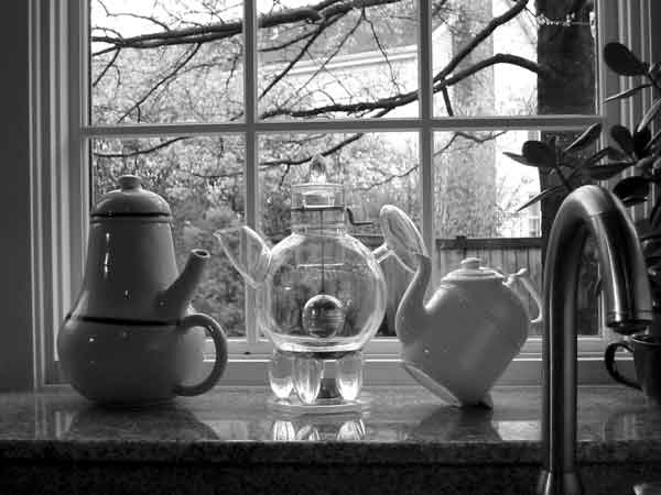
Photo by Ayman Shamma, from Don Norman's collection. (source)
Everyone feels different levels of attraction to these attributes, but a well crafted product will attract the most interest simply because it touches on all three aspects of design. Let’s take a look at how the temperature project makes use of the three elements:
Visceral elements
- Initial animation: abstract art transforms into something familiar – a map of the world
- Choice of colors and shapes and styles
- Underlying satellite imagery (hidden surprise!)
Behavioral elements
- Allows users to easily navigate over 100 years of temperature data that was previously hidden away in text files in a confusing nest of jargon-filled HTML pages on NOAA’s website
Reflective elements
- Allows users to see their own times and places in a bigger context. it allows them to recall personal stories and to have thoughts about our planet
We believe that we were able to find this audience because of the visceral beauty of the project. For us, this validates that visual appeal and novelty (new experiences) are very effective means of reaching people. Within three days of releasing the project, we saw over 25,000 visitors and 400 tweets, most of which can be paraphrased as “Wow, this looks so cool!” Commenters said that project was a good example of “art + science” and it was reposted by a number of brands and publications.
THERE’S UTILITY, AND THERE’S ART
Our main take away and guide for future projects is that art is a perfectly reasonable driver for a visualization project. However, just as important as it is to not let utility get in the way of an artistic expression, it is crucial that an artistic piece does not try to pretend to have a focus on utility. In the work we do for our clients at Halftone, our primary focus is still to provide utility through the use of data visualization, even if we add touches of art here and there. For other creators out there, we recommend to simply schedule time for fun projects and experimental ideas. Get your experiments to a point where they can be released so you that might entertain and inspire others to carry the idea forward; don’t trash ideas only because they seem to have no utility.
A special shout out goes to our good friend Ian Johnson, whose input influenced this project more than just once.